Salute to Poppy Parade

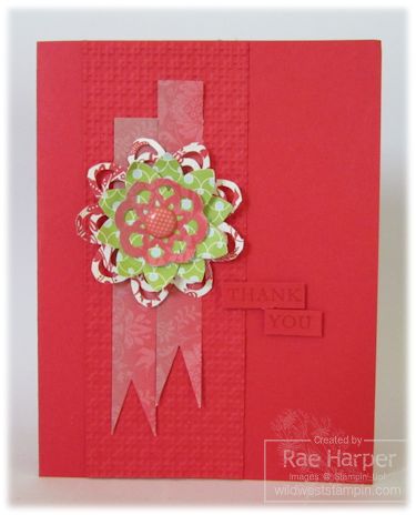
Poppy Parade, one of the retiring In-Colors has become one of my favorites. I didn't appreciate this vibrant color until I opened a pack of "Everyday Enchantment" Designer Series Paper from this year's Sale-A-Bration. I'm really sad to see this beauty go.

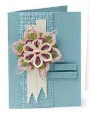
If this card looks familiar, it is. You'll find it featured on page 18 of the 2012 Occasions Mini catalog in blue. It's interesting to see how a simple change in color changes the entire feel of the card.
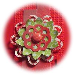
One of the things I like about this design is the subtle sentiment achieved by using tone on tone. It's light enough to make the reader pull it close, and dark enough to make them realize there's something more. A little tease to have them really look at the card to appreciate the texture and layering you've done.
.jpg)
Most things on this card are retired or retiring but I hope you'll be inspired to see what you can do with a favorite design and different color choices.
Tips & Tricks: Experiment with color and texture using a card you've created in the past as your template.
Nuts & Bolts:
Approximate 4-1/4" x 5-1/2" (A2 Envelope)
Supplies:
* Card stock – Poppy Parade (retiring May 31, 2012)
* Designer Paper – Everyday Enchantment (2012 SAB, retired)
* Ink & Coloring – Poppy Parade (retiring May 31, 2012)
* Stamps – Simple sentiment of your choice
* Embellishments – #122940 In-Color Printed Brad Assortment
Tools:
* Punches – #119880 5-Petal Flower; #122362 Lace Ribbon Border
(Both punches retiring)
* Big Shot #113439; Embossing Folder #119976 Square Lattice;
Sizzlet L Die #125592 (Paper Doily)
Adhesives:
* SNAIL Adhesive #104332
* Stampin' Dimensionals #104430
* Glue Dots #103683
Have a fantastic Monday and thank you so much for stopping by!


Comments
Salute to Poppy Parade — No Comments
HTML tags allowed in your comment: <a href="" title=""> <abbr title=""> <acronym title=""> <b> <blockquote cite=""> <cite> <code> <del datetime=""> <em> <i> <q cite=""> <s> <strike> <strong>