Joyous Standing Pop-Up for Creative Creases #67
Welcome to Creative Creases Challenge #67. We’re here to inspire and challenge you to play along with us. More on that later.
My fold today is called a “Standing Pop-Up Fold”. This fold is perfect for showcasing a great Designer Series Paper Winter Meadow.
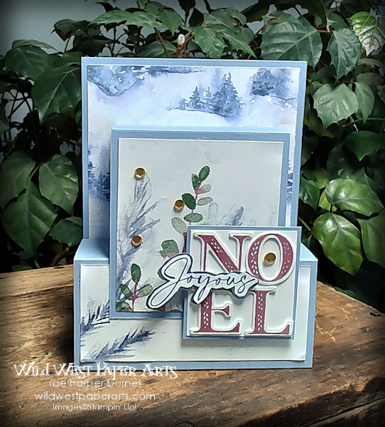
It always amazes me how these beautiful folds can lay flat for mailing. It even fits nicely in a standard A2 envelope.
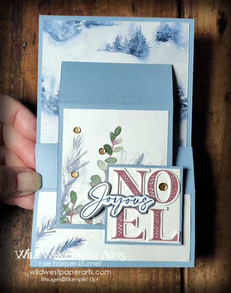
Where does a person write a greeting? A perfect place, the back panel.
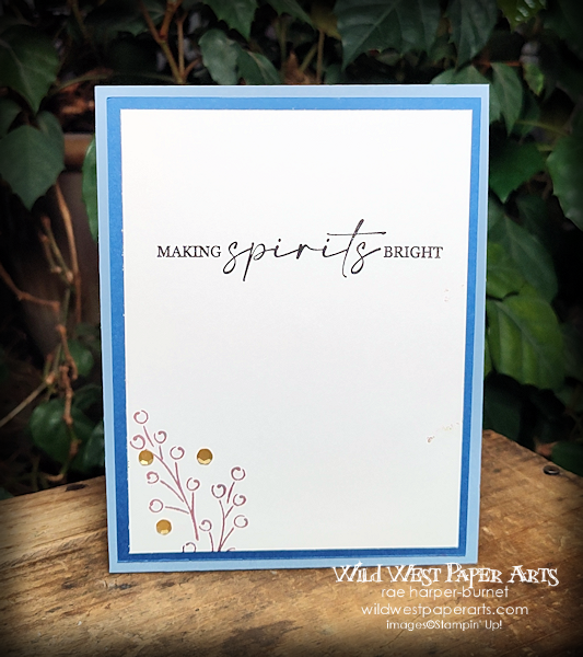
Find a printable tutorial for this fold on Splitcoast Stampers. Here’s the link Standing Pop-Up Card.
Give your detail a tiny lift without using Stampin’ Dimensionals . Sometimes Dimensionals are more than you need. Check out the word Noel.
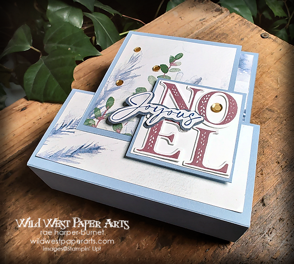
Die-cut the letters twice. Layer and glue them together. Just a little lift.
Another tip, perfect placement. Noel was stamped on a Basic White cardstock square. Then, the stacked letters mentioned earlier were glued on top of them. Perfect!!
Join us for Challenge #67. click on the link button below for more information. What will you create for the challenge? No blog necessary.
Thank you for visiting.…
Have a Wildly Creative Day!

Don’t forget to leave a comment. I love to read and respond to them.
Click to Leave a Comment


omg Rae – what a cute card!!! I just love this!
Thank you so much Paula. It was a fun one to make
Rae, this is such a lovely Christmas card! Those papers are gorgeous, and the sentiments are very pretty, too! I love the stamping you did on the back panel! And the gold sequins on the front are such an elegant touch!
Thank you so much Carrie.
Oh, Rae, this holiday card is lovely and you used one of my favorite folds to make it. I like how you did the NOEL. Yep, less is more – when more is too much! Have a wonderful weekend!
Thank you Debbie. This fold is a new one for me. It may become a favorite as well.
What a lovely card! The fold is very cool and I love the papers that you chose. The NOEL sentiment works perfectly!
Thank you so much LeAnne. I struggled with the Noel placement at first. Tried to add too many embellishments. Went back to the drawing board for this result. Sometimes Less IS more.